small print footnote : this design is in no way intended to look like that, it’s only purpose is to present UI concepts and ideas, not a look. I just took care of doing something clean and readable.
iDraw, a vector drawing software.
The Inspector Palette :
To reduce interface clutter, instead of many palettes, an inspector shows only the controls appropriate to the selected object :
Minimize interface interference:
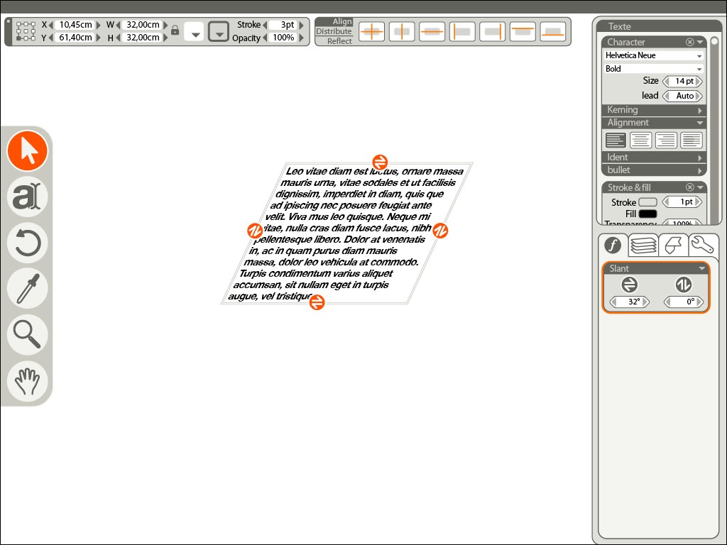
Selecting an object displays a selection box with explicit control according to the selected tool or effect.
And the big helper is that these controls disappears while interacting and while the cursor is distant of the object.
To maximize interactivity and visual feedback,
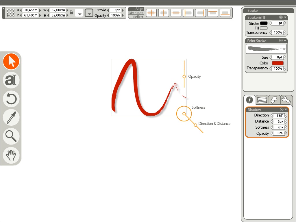
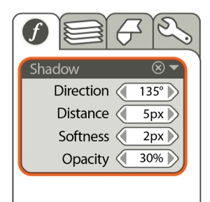
When an effect is selected, appropriate controls can be displayed over the object to allow visual interactive feedback. When used, the controls fade away to have a better view of the modifaication.
Powerful and simple pipeline:
Everything, when appropriate, is an effect or an object properties.
Instead of multiplying tools we implement them as effects.
Example : nothing differentiate a circle from a square but the “type” of the shape. It also could be a spiral or a star. It stays as an editable procedural object until decided otherwise.
Instead of a Paint, Slant, Gradient or Deform tools, we have effects. They are always editable or undoable and they possess their own visual interface.
Very few tools :
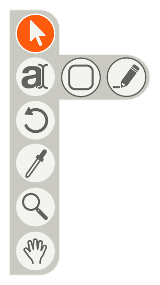
select and pen modify tool
Create tools : Text, Shape and stroke.
Rotate tool (might be incorporated with the “move-scale” interface)
eyedropper
navigation tools : zoom and pan.
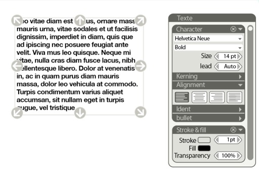
Text
Everything property you want to edit about text is here at the same place.
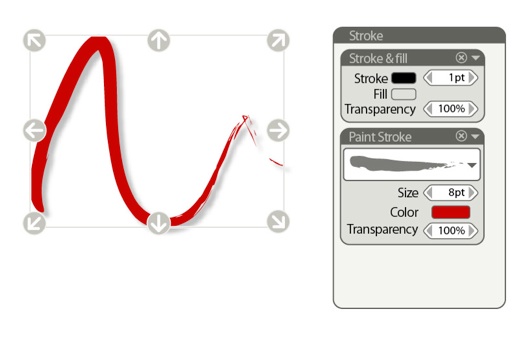
Stoke
Stoke can be stroke, obviously, but also paint stroke and add one more stroke filter and you have multiple strokes at once.
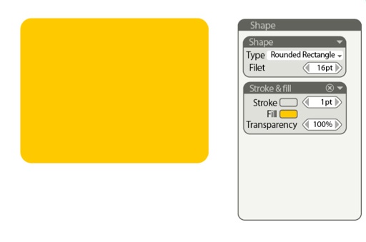
Shape
Shape can be rectangle, circle, spiral... you name it, just change the type.
they can be converted to stroke whenever wanted.
We may loose in the process a certain kind of spontaneity in the gesture. for example the gradient tool will sort of loose its drawing feeling. This is where there is some clever work to do in the way to design the visual interface of this effects.
The capacity of the controls to disappear will help us in this attempt by allowing very visual and comparatively large onscreen widgets.
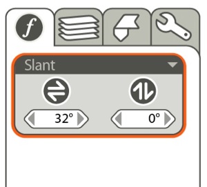
Slant in action:
very visual controls on the object are replicated numerically in the effect panel.
Due to the nature of iDraw, we really need only a handful of tools as verb-noun commands:
obviously a drawing tool can do : text, shape and stoke.
An eyedropper / paint bucket
and the usual navigation tools.
Even the rotate command should be integrated in the default behavior of a selected object.
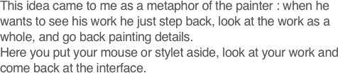
The idea of idraw came to me because the widgets to manipulate objects in the majority of drawing softwares are either too small to be comfortable to use and too large not to be distracting while you look at your layout. I think that technology like Quartz allows a great deal of improvement in interface design that are yet to happen.
I chose to favor comparatively big and explicit widgets and to compensate I tried to find a way to hide them effortlessly.
(This is in no way what it should look like, but it shows how widgets could be displayed over the object according to the selected effect )
Other Palettes :
On the right side of the screen, we find four other tabbed palette. The tabs are labelled with icons which take less space and are far easier to identify than strings of text.
The effect palette is where all the effects are applied.
In the favorite panel, every object property or effect can be saved as an alias and when used, any modification of the effect is spread to each of its instances.
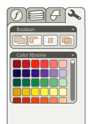
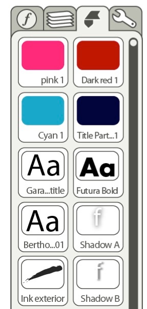
The tool palette contain less used helping palettes, like boolean, color librairies, Symbols and shapes...
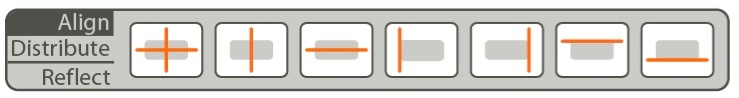
The classical Align and Distribute Palettes have been merged : select the desired function and then the axe you want.
I also put here the mirror function which work the same way.
Also note that there is a very handy feature, the first icon, that allows you to Align by the center : one click instead of two on a very common use.