

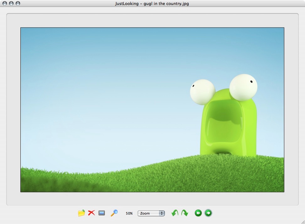
justlooking in version 1.1
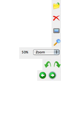
“Open file” dialog box : not very clear and somewhat useless as JL is mostly being used by double clicking a picture.
Delete : almost OK but the size and proximity of other icons is dangerous.
Full screen slide show : does not convey the function very well
find ? zoom ? no, show the file in the finder!
Zoom level : understandable but not very easy to interact with.
Rotate : OK but could be mistaken with undo-redo.
Previous-Next image. OK, this is THE killer function of JL.
justlooking is a very simple OS X image viewer.
It as a very convenient function you find in the windows picture viewer:
It allows, once you have opened a picture, to see the next or previous one in the same folder by clicking onto the according button.
In version 1, despite this great function it suffers from some shortcomings:
The buttons are not very Mac friendly and they does not convey their functions very well.
Functions of the icons and observation:
A trash basket icon to delete files
Show the file in the finder
Rotate
next, previous image
Play the slideshow
zoom -
Display at 100%
zoom +
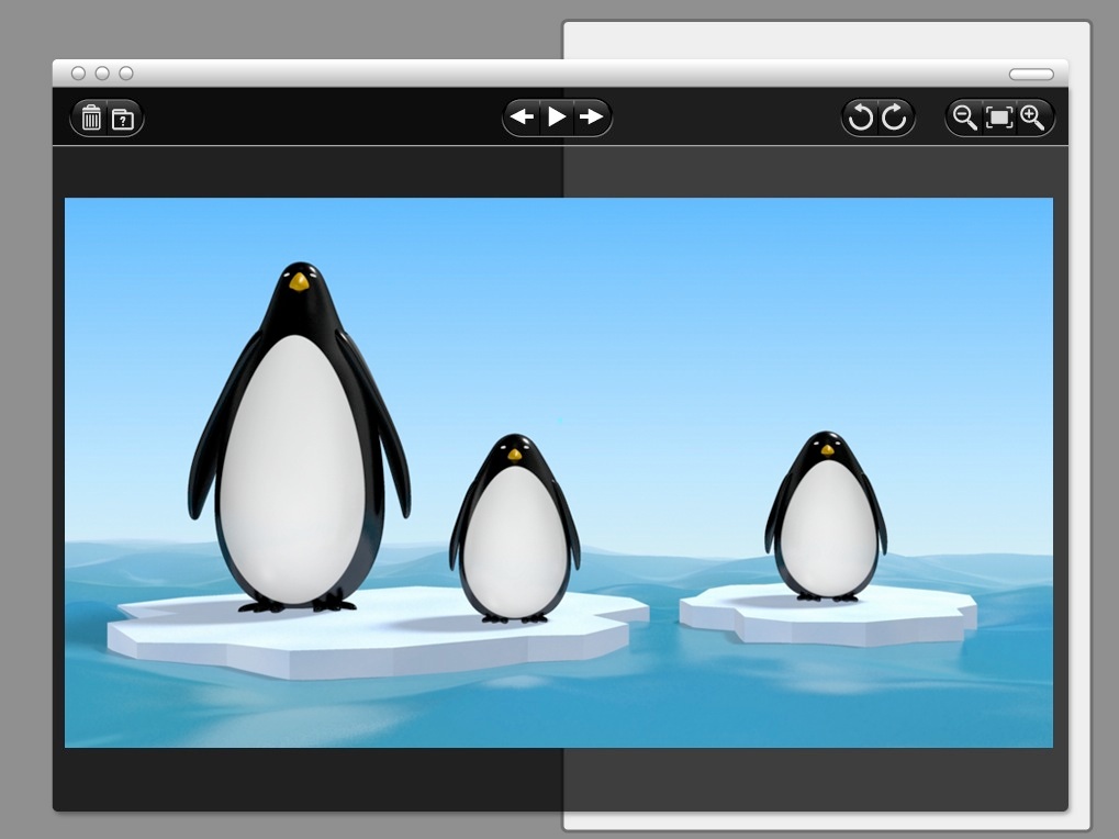
What I ended up sending as an alternative interface to the programmer :

Icons and their meanings :

Buttons that act with the file.

Buttons to navigate between files.

Buttons hat act on how the file is displayed.
justlooking is developed by Marc Wandschneider of Chipmunknija.
As I use it as my default image viewer, that little windows icons were a real pain to see, so I designed a new interface that I sent to Marc to see how he like it.
I choose a semi transparent black background because, more than being trendy, it is also very convenient to separate the picture from the desktop in an elegant way.
I choose a very stylized inverted black and white design for the icons look because it was easier to design it that way and I’m not a very good “pixel pusher” but I would not have made that choice in the case of a more complex interface as it make the icon less readable when their number grows.
3 distinct areas
New icons : show/hide the preview window panel, show info and save if we rotated the file.

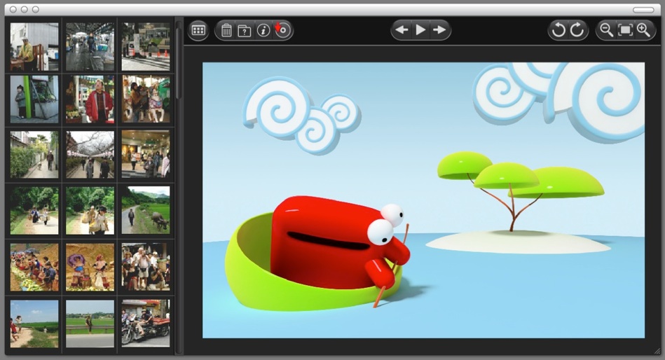
Part II :
As Marc, the programmer, did enjoy the designs, he ask me for more:
A new window panel allow to have a preview of the folder’s content.
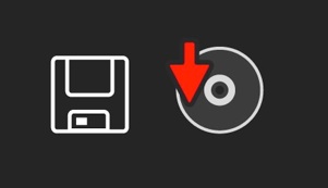
Save Icon :
I know that the floppy disk icon is known to everybody but I think that it will be harder and harder to explain to newcomers why this icon is to save a file as less and less people know what a floppy disk is.
I tried to modernise the idea and show an icon than can be interpreted as a disk platter or a CD instead.
I haded a red Arrow to convey the idea of writing.

I also proposed Marc to change the application icon design to something that convey a better understanding of the purpose of Justlooking.
